View Details
Work Details
Kula
Homepage Revamp
Redesigned Kula’s homepage to simplify a complex ATS and drive measurable conversion growth.
Role:
Solo Designer - End to End
Scope:
Visual Design · Motion · Web
Industry
AI Recruiting / HR Tech
Duration
One Month
Kula.ai, a AI-native ATS
Kula is an AI-powered recruiting platform built for talent teams. It combines sourcing, outreach, and candidate management into one tool — helping recruiters move faster without losing the human side of hiring.
Old site had no story to tell, and everything else followed, broken brand consistency, sizing issues, design all over the place.
01 The Problem
Visitors couldn't figure out what Kula actually did.
People landed on it, scrolled past disconnected feature lists, and left, not because they weren't interested, but because nothing clicked fast enough.
The page was written for people who already knew Kula. Wrong audience for a homepage.
The page was written for people who already knew Kula. Wrong audience for a homepage.
"The product was Fresh & Vibrant. The homepage made it look average."
SYMPTOM 01
High bounce rate, visitors not scrolling past the fold
SYMPTOM 02
Feature-first structure, no emotional hook or narrative
SYMPTOM 03
Visual language didn't match the Modern product
02 The Approach
How I structured the solution
01
Narrative audit & content hierarchy
Mapped every section against how a first-time visitor reads the page. Found where the story broke and rebuilt the flow: awareness, value, proof, action.
02
Visual language & design system
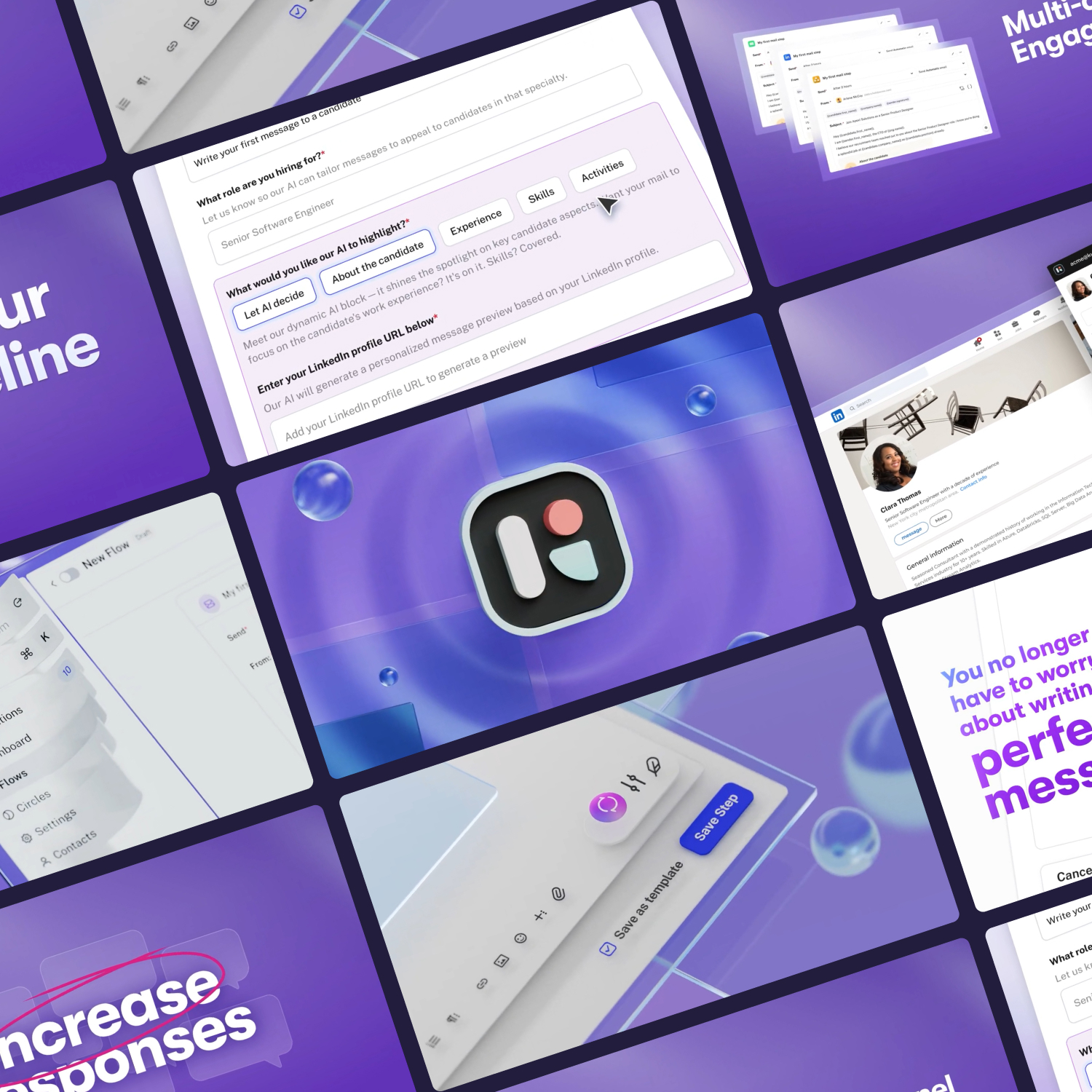
Built a clean, confident visual system with room to breathe. Made custom product illustrations and feature visuals so each section could carry itself without leaning on copy.
03
Wireframes & layout explorations
Ran three layout directions in low-fi before picking one. Wanted to get section order and density right before touching visual polish.
04
Motion & interaction design
Added motion where it had a job to do, scroll reveals, feature animations, small interactions that pull the eye through dense workflows.
05
Handoff & Webflow implementation
Shipped production-ready files and a lean Webflow build so the motion and visual quality didn't get lost in handoff.
03 Wireframes
Low-fidelity to high-fidelity
Tried three homepage directions before committing. Story-first, product-first, proof-first. Ended up blending all three.
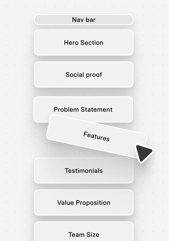
Reordered the sections so the page tells a story, users can follow along without having to think about it.
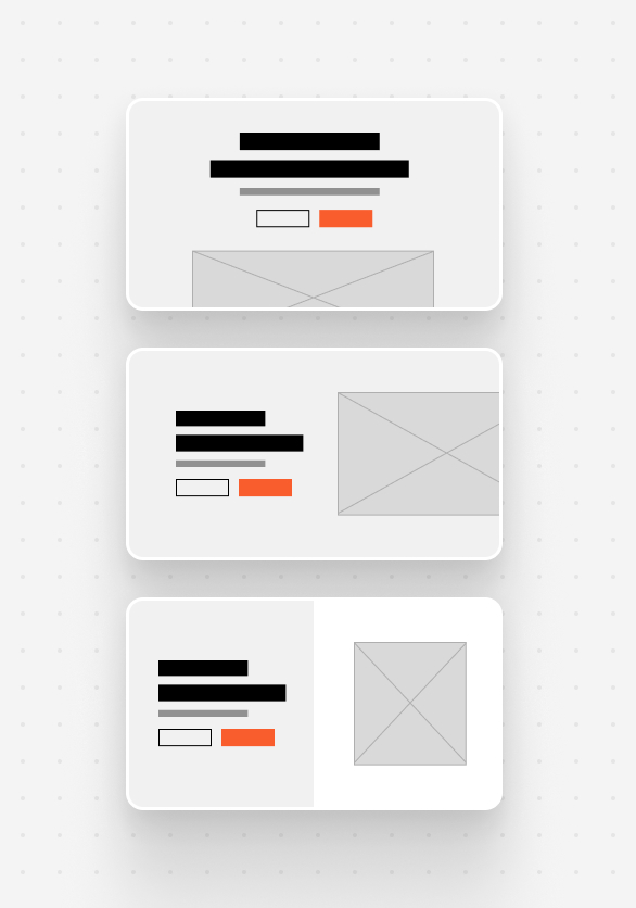
Tried a bunch of layout directions, ended up mixing grid styles while keeping the brand consistent across the board.
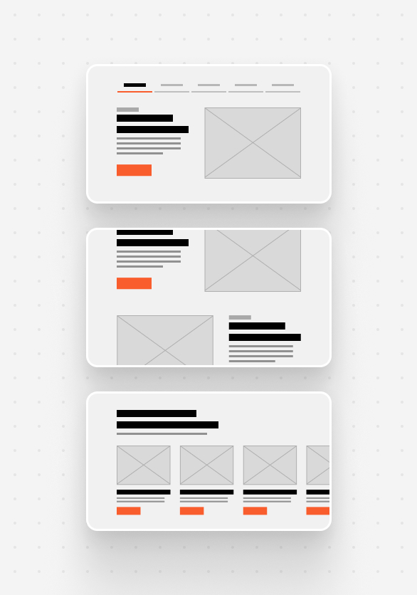
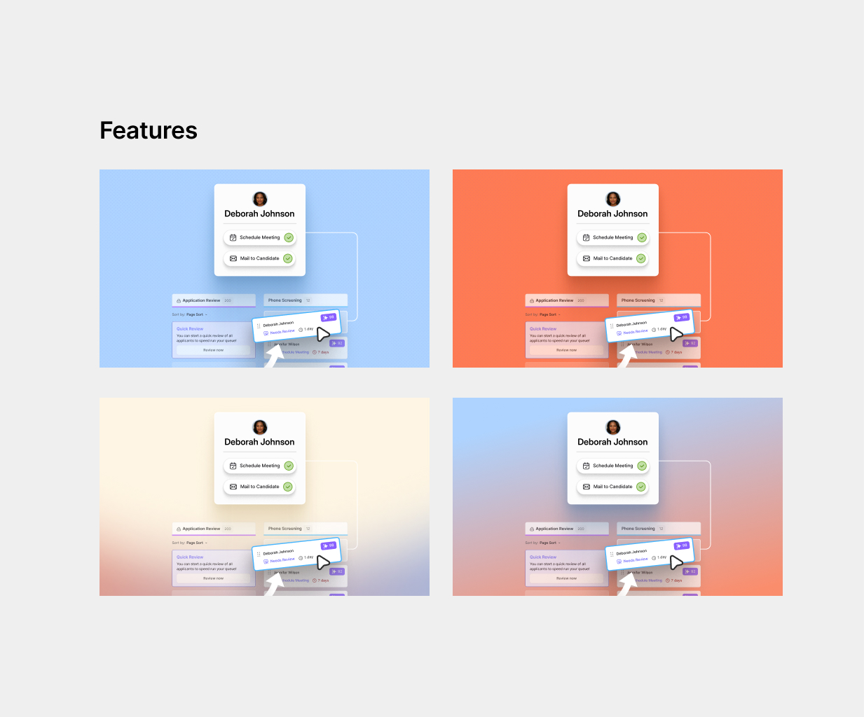
Put features in tabs, less scrolling, easier to explore.
04 Visual Language
Building a Vibrant brand feel
Wanted the design to carry the same weight as the product, sharp, modern, credible.
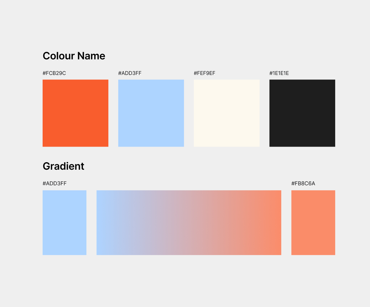
Colors were already there. Just had to figure out where they belonged.
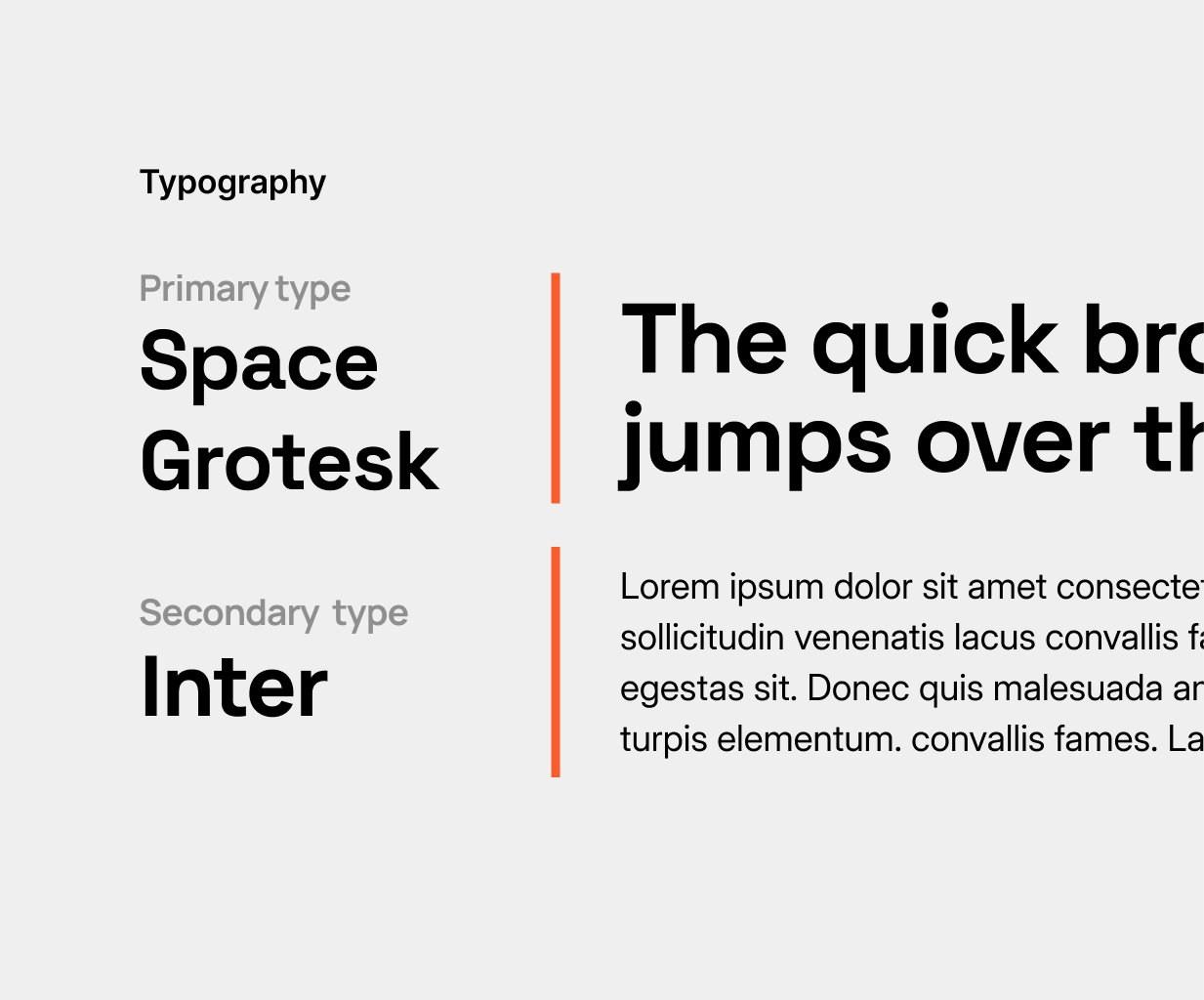
Space Grotesk for headings, it felt right. Inter for body, hard to go wrong with it.
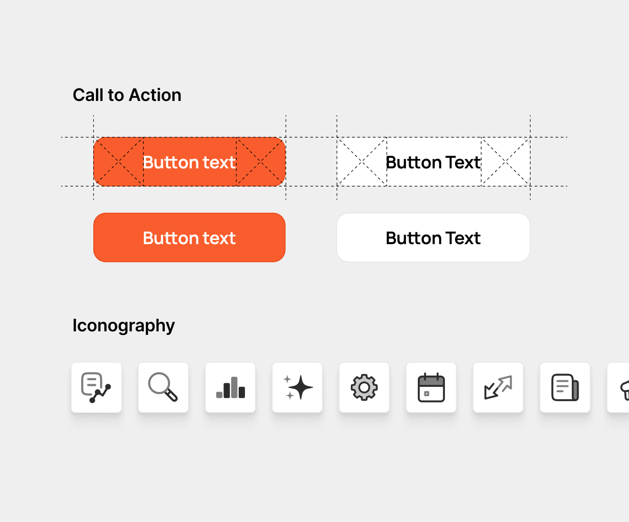
Monotone icons keep things clean. CTAs are direct, no guessing what to click.
Tried a few animation styles, kept it on-brand, and swapped between months.
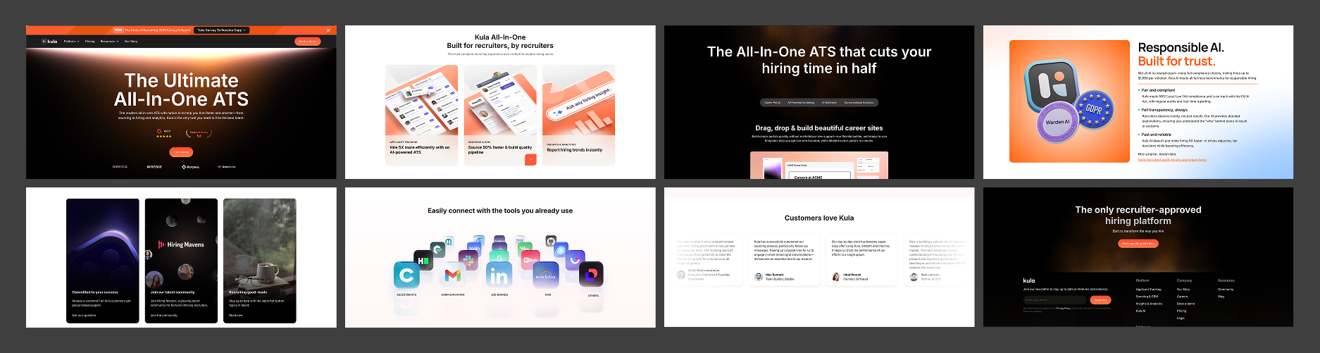
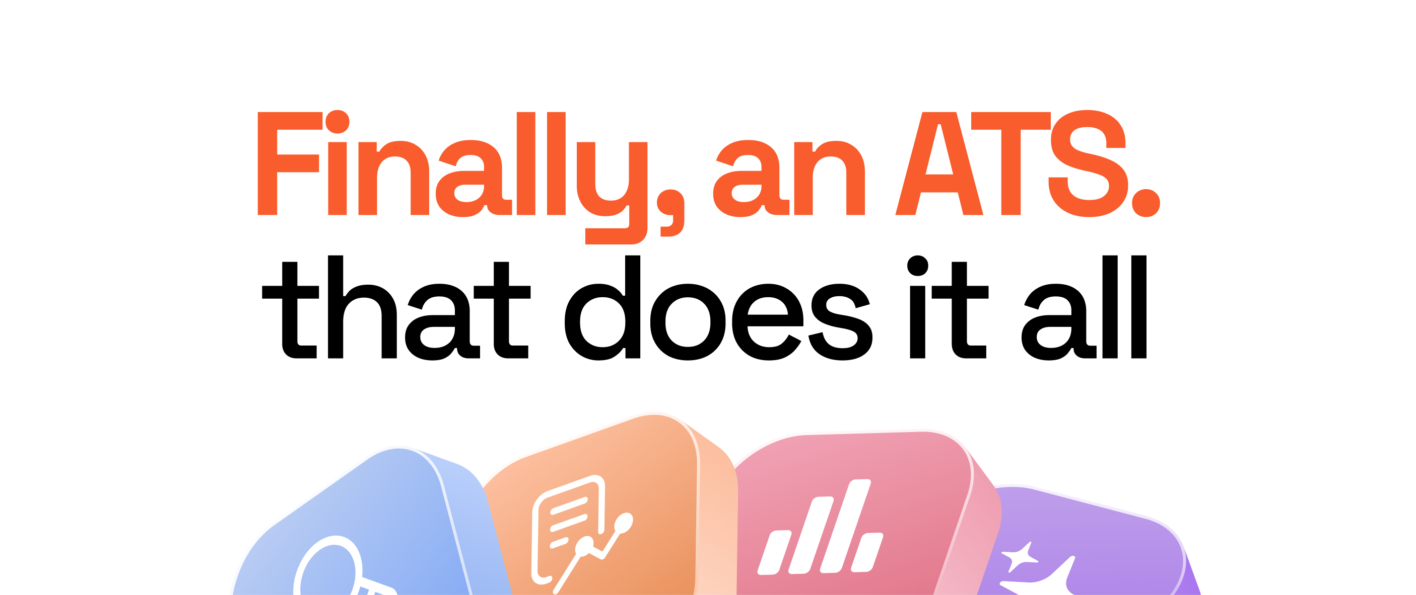
06 Final Design
The redesigned homepage sections
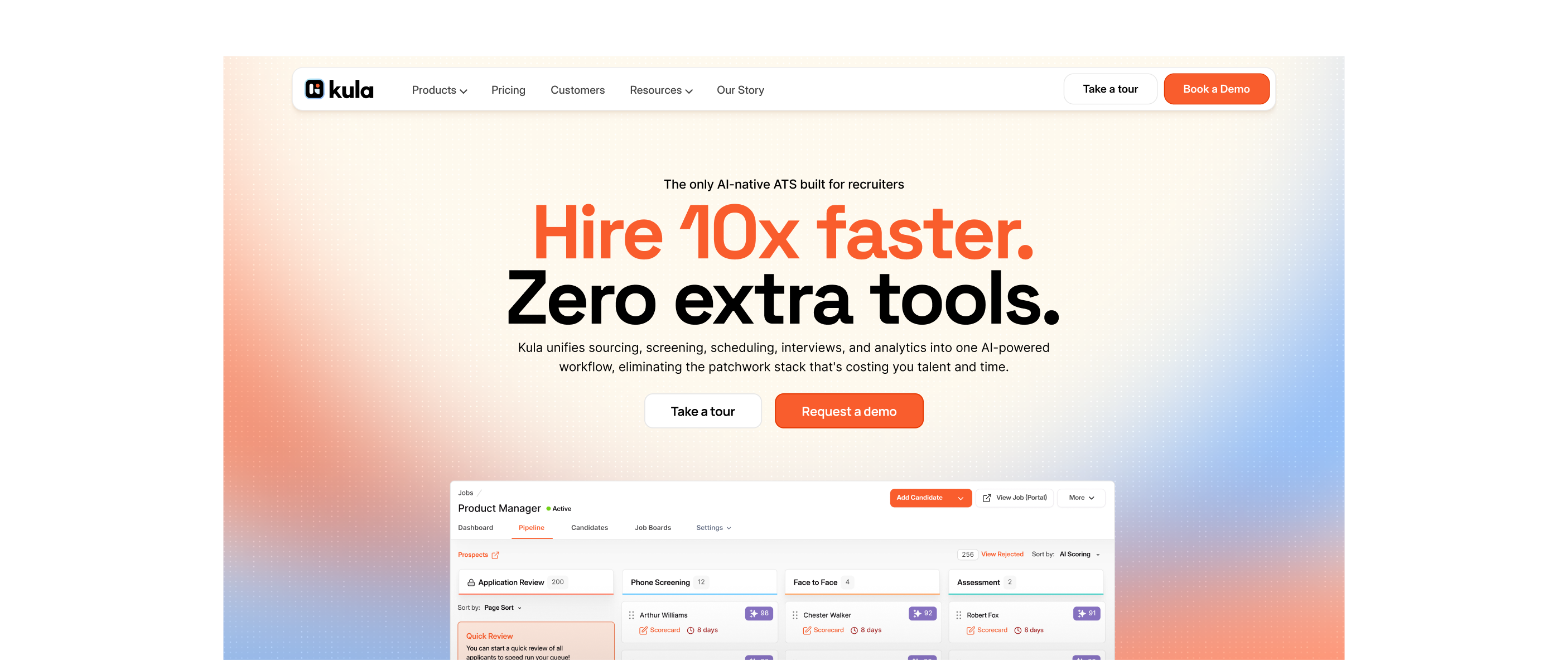
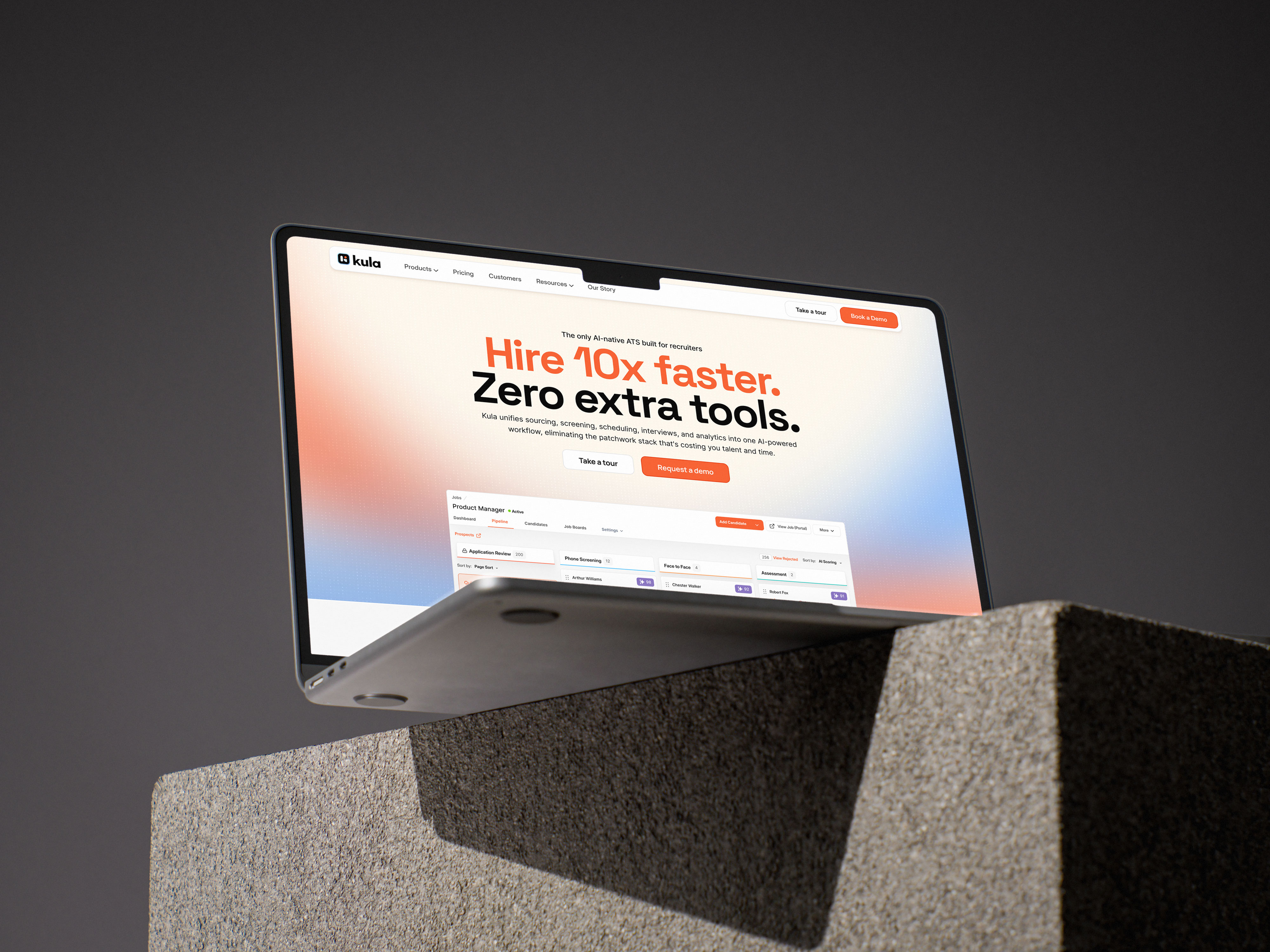
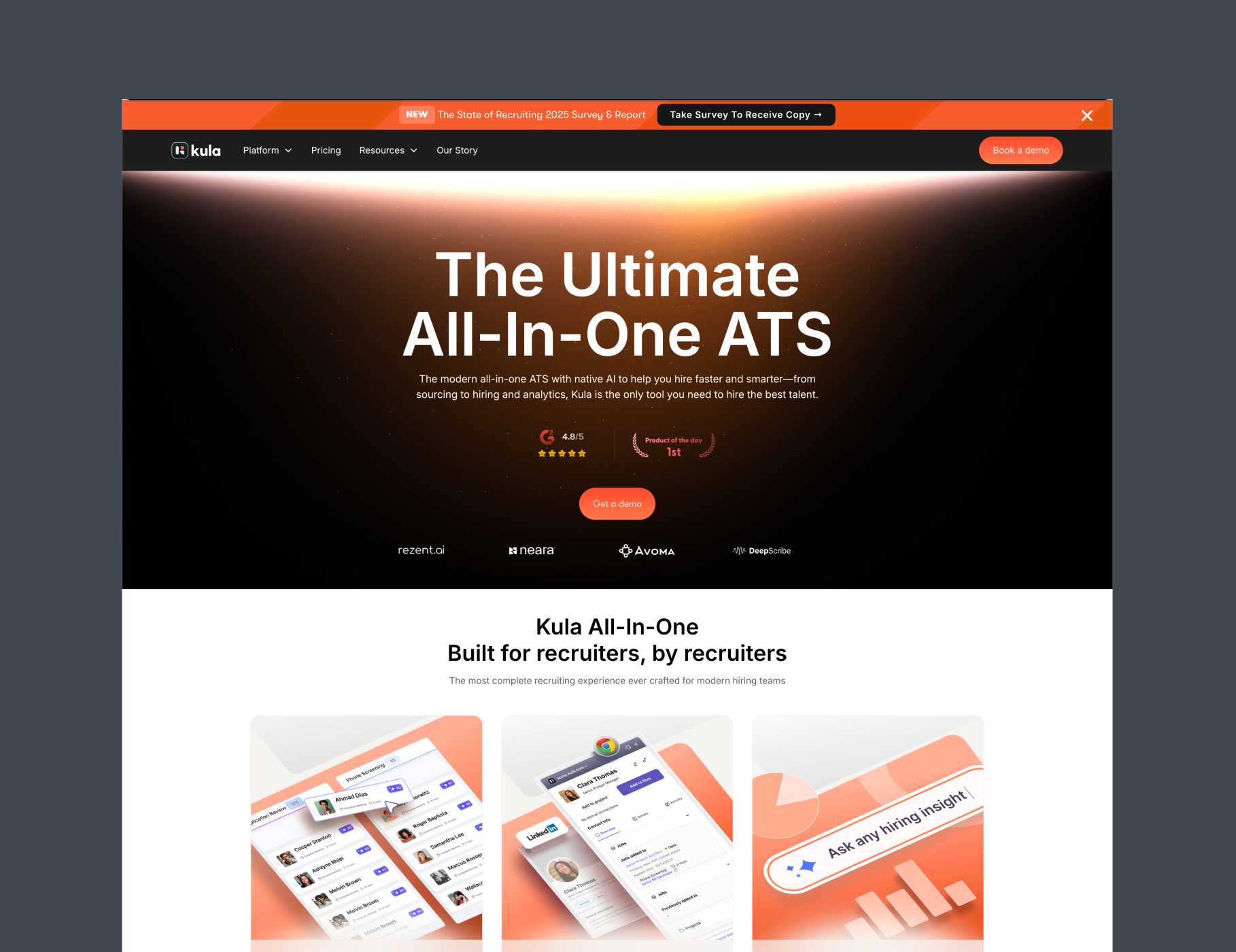
Went with a centered layout and kept the visuals in Kula's style. Two things mattered most here: a visitor should understand the product in seconds, and the page should load fast.
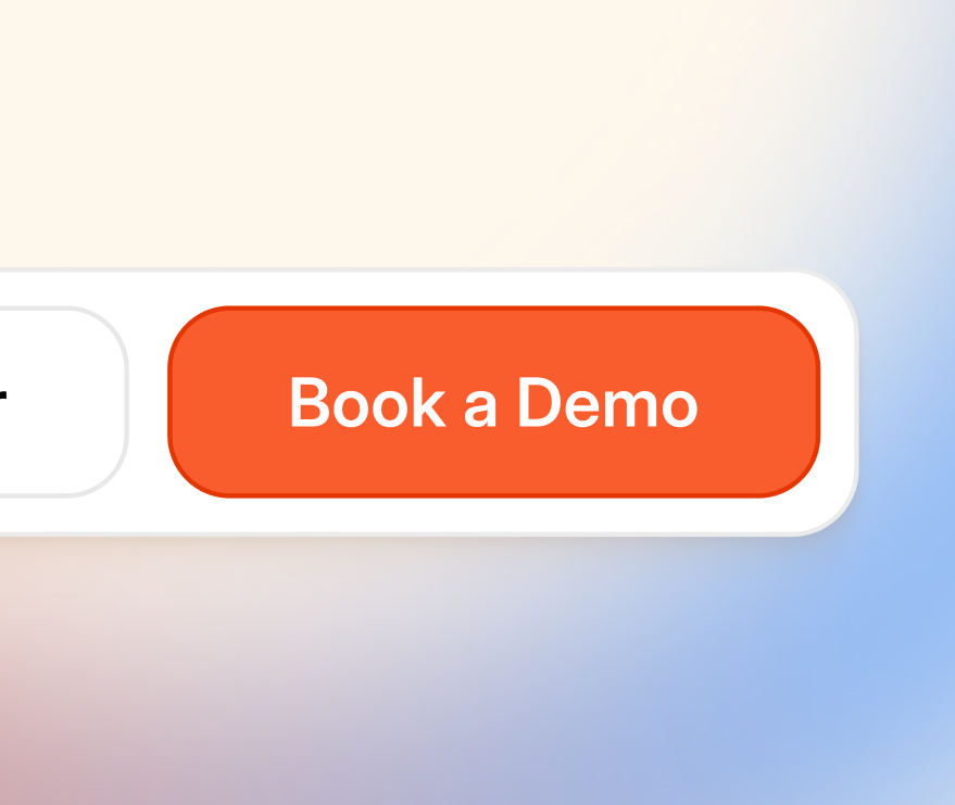
CTAs sit in clear spots without breaking the flow. Easy to find, but they don't get in the way.
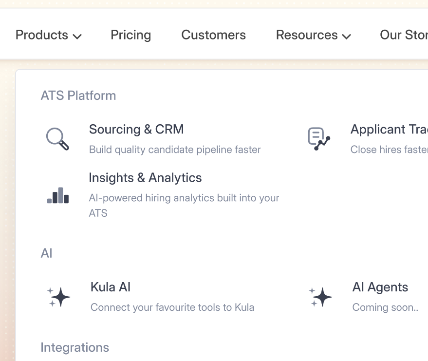
Added more breathing room between products in the nav dropdown. Less crowded, easier to scan.
Split the trust section in two. 1st Logo scroll with 30+ logos goes right below the hero, gets credibility in early.
Used Swiss-style typography through the following sections. Clean grid, precise hierarchy, nothing decorative getting in the way of the message.
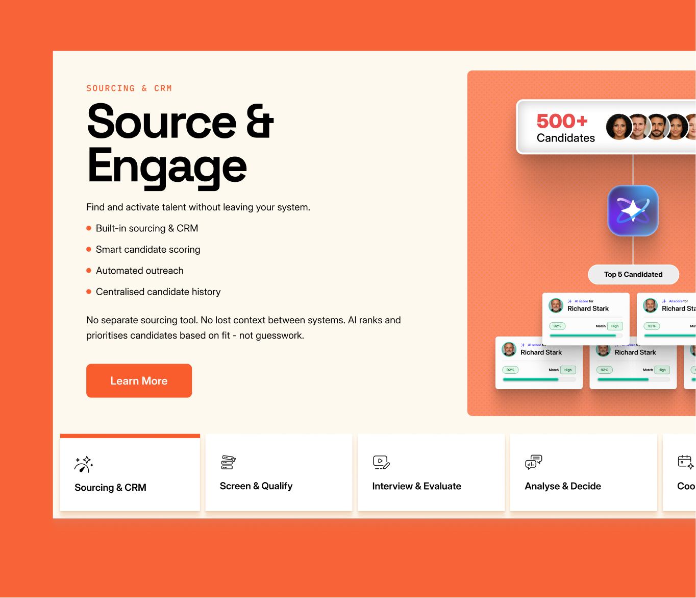
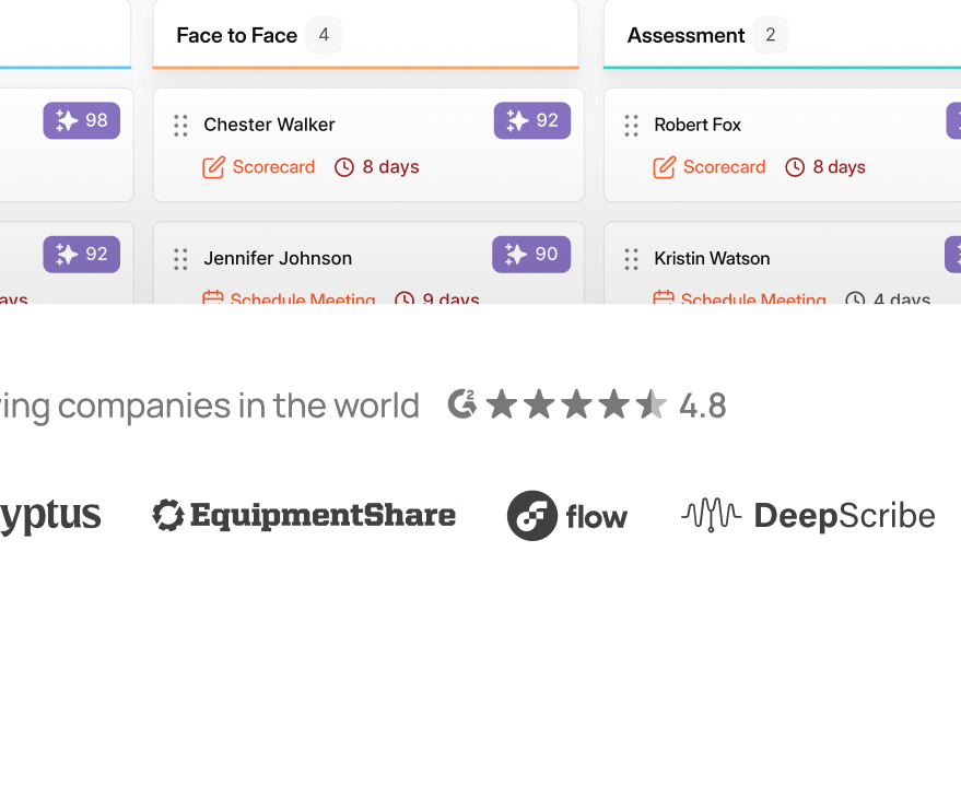
Tabbed layout reduced scroll depth while keeping all features accessible
Right after the problem, there's a scroll animation that walks through Kula's features one by one. The structure was intentional, problem first, then the solution reveals itself as you scroll.
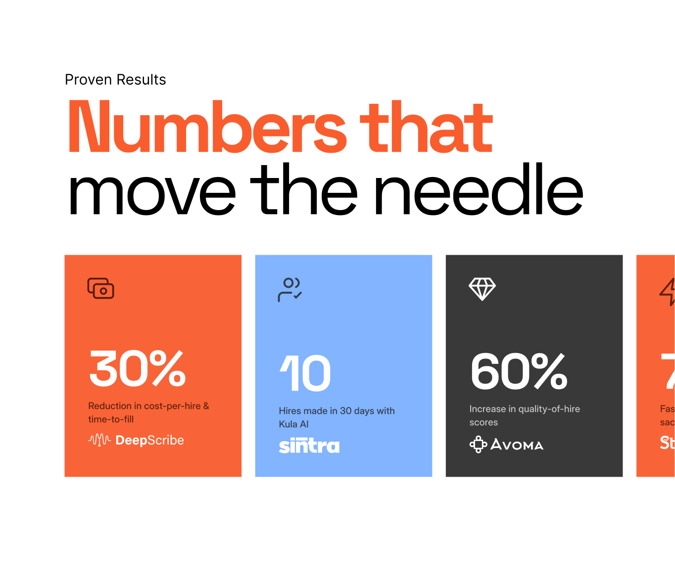
Kept the value proposition section bold and visual. The numbers are the message, so they get the most space.
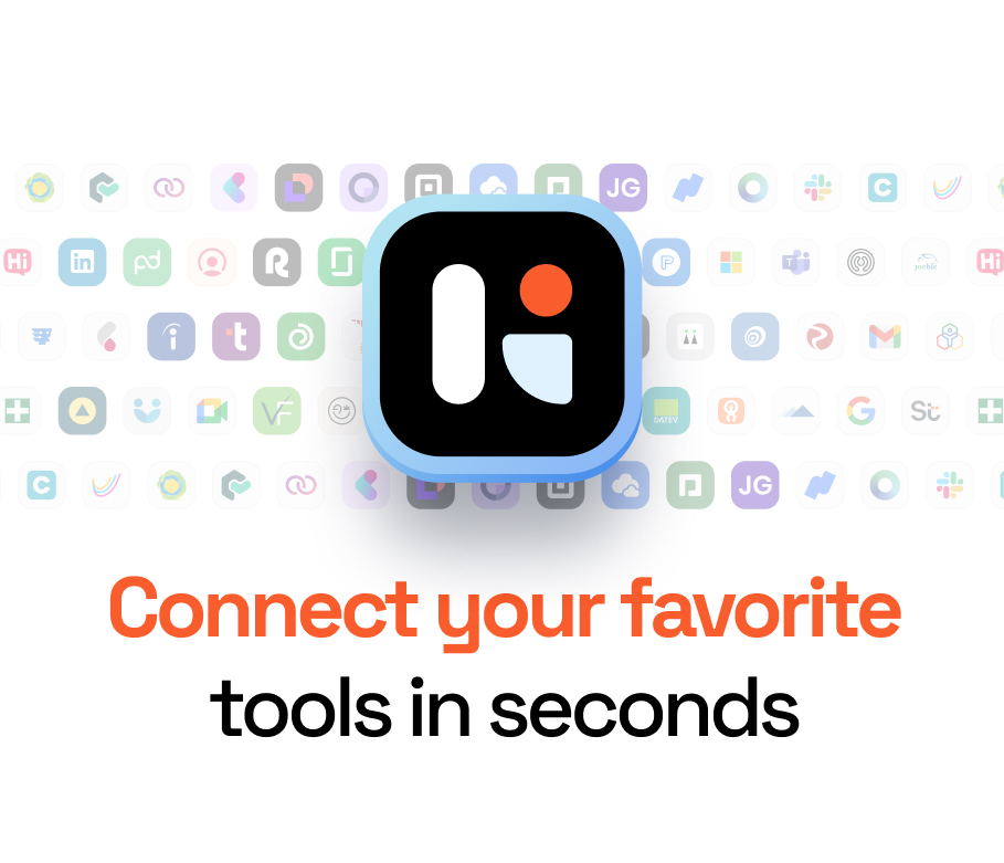
Integrations are one of Kula's strongest selling points. Rather than dumping all the logos in a grid, I made them scroll in the background, shows the range without overwhelming the section.
07 Motion Design
Motion that explains, not just decorates
Every animation was designed to reduce cognitive load showing how the product works rather than asking visitors to read about it.
AI Scoring
Pipeline management
AI Notetaker
Conversational analytics
Before
New

08 — The Impact
Results after launch
30%
Bounce rate reduction People stuck around after the revamp shipped.
18%
Conversion rate lift, More demo signups, more CTA clicks.
62%
Time on page increase, A clearer story kept people reading to the end.
09 The Outcome
The revamp turned a confusing product page into a clear, compelling story, one that made Kula's AI platform feel as intelligent as it actually is.
WHAT CHANGED
Visitors could understand Kula's value within 10 seconds of landing — down from needing to read through multiple sections.
KEY LESSON
The best homepage design isn't the most beautiful one, it's the one that makes the next click feel inevitable.
Related work

Kula Brandbook
Creating a scalable visual identity system to unify product, marketing, and brand communication
Branding · Design System · SaaS
Product Explainer & Promo videos
Simplifying product features into engaging motion-led narratives for marketing and onboarding
Motion · Product · Marketing