View Details
Work Details
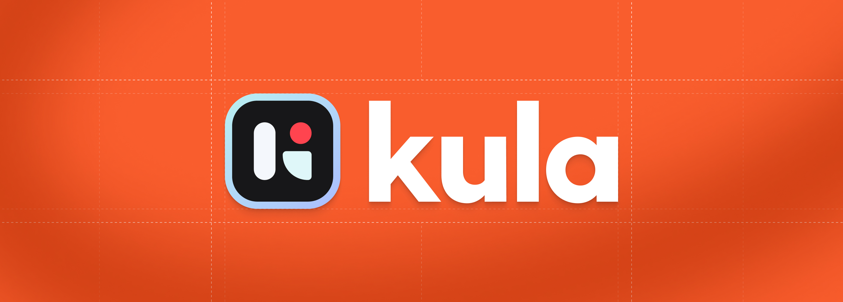
Designing Kula's
brand identity
A look inside the Kula brandbook, how the identity came together, piece by piece
GTM Team
Research
My Role
Design
Implementation
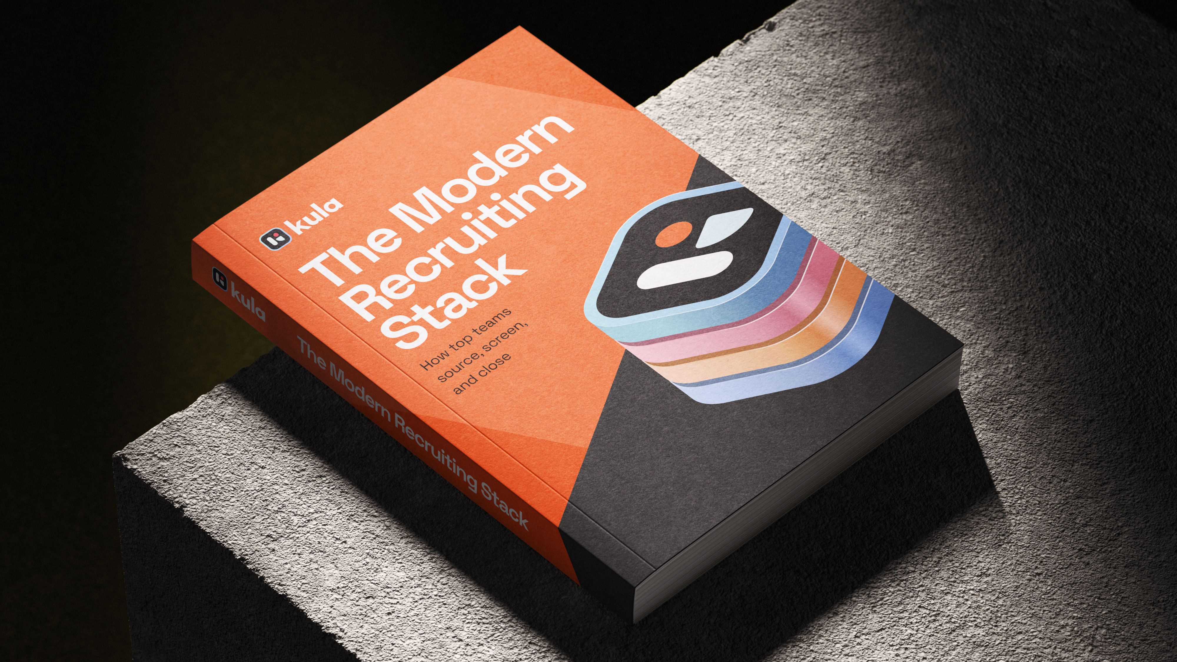
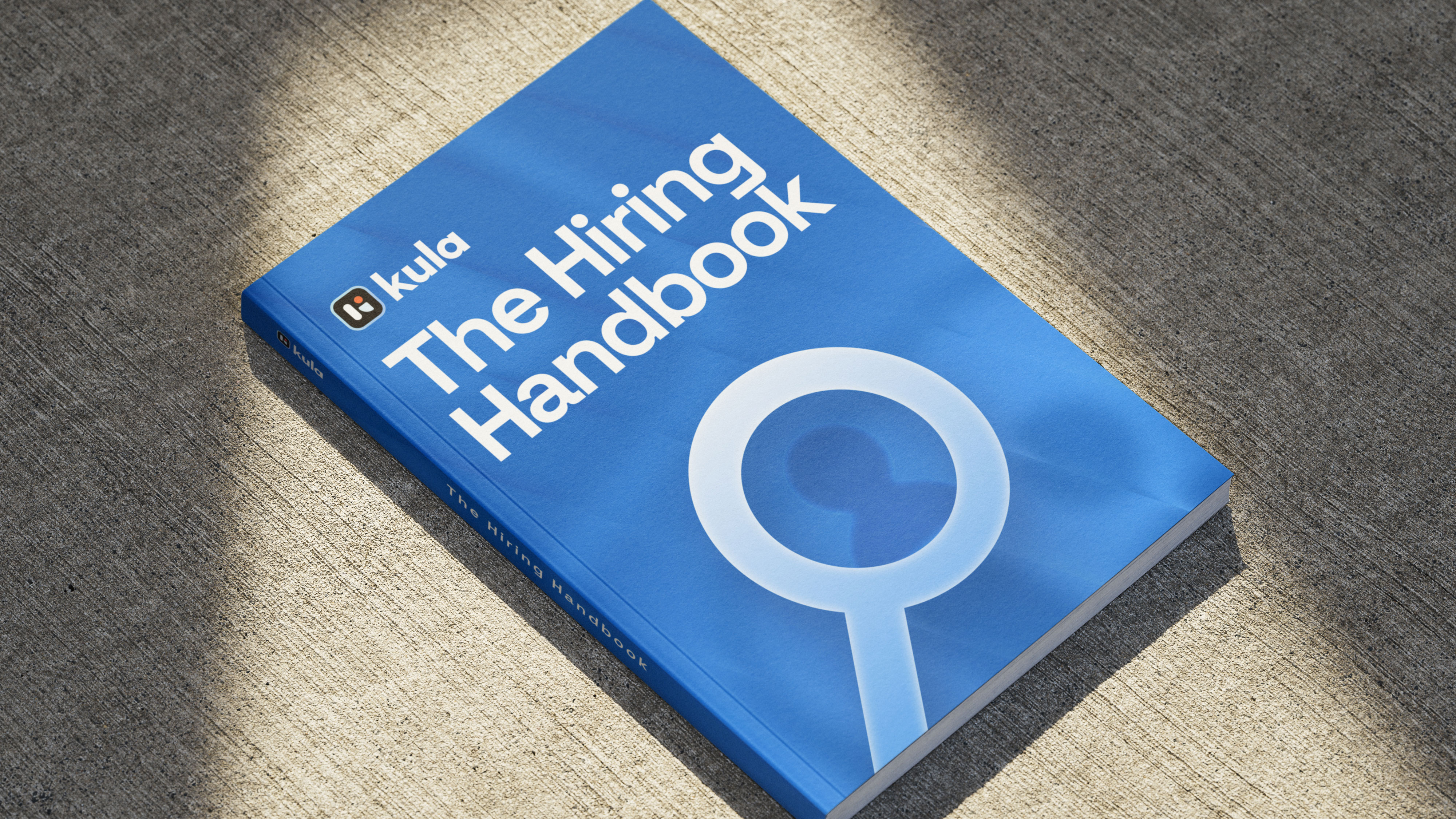
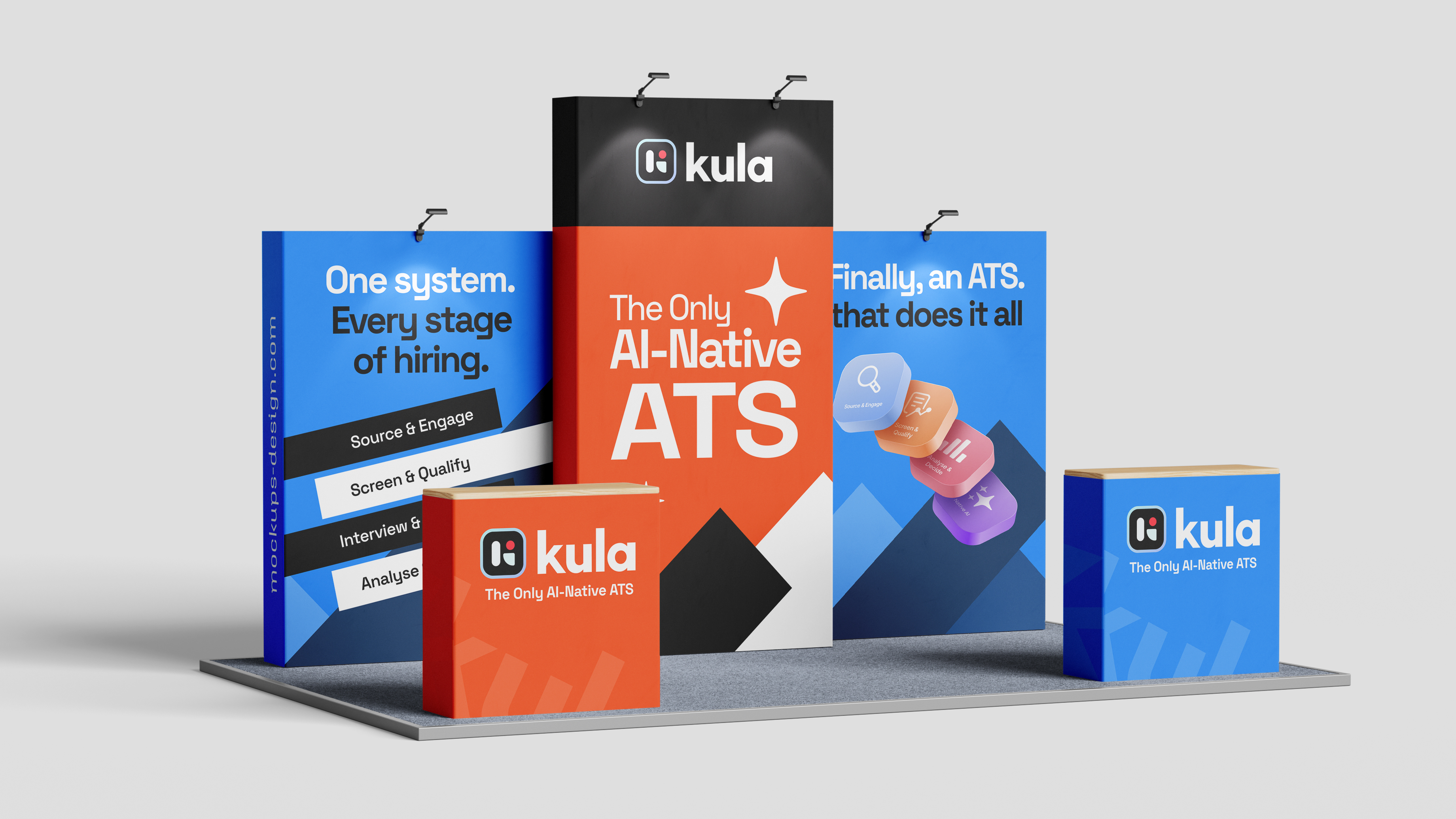
Document
Why rebrand?
The brand began as just a logo. We picked a color early on to stand apart from competitors and the usual SaaS palette, but with no brand book or guidelines in place, keeping the style and tone consistent across work got messy fast.
Brand Personalities
After GTM research with the internal team and a few users, we landed on a brand tone between Excitement and Competence. The shorthand: confident and capable, but with energy. Modern and premium, but willing to be loud when it needs to be.


Moodboard
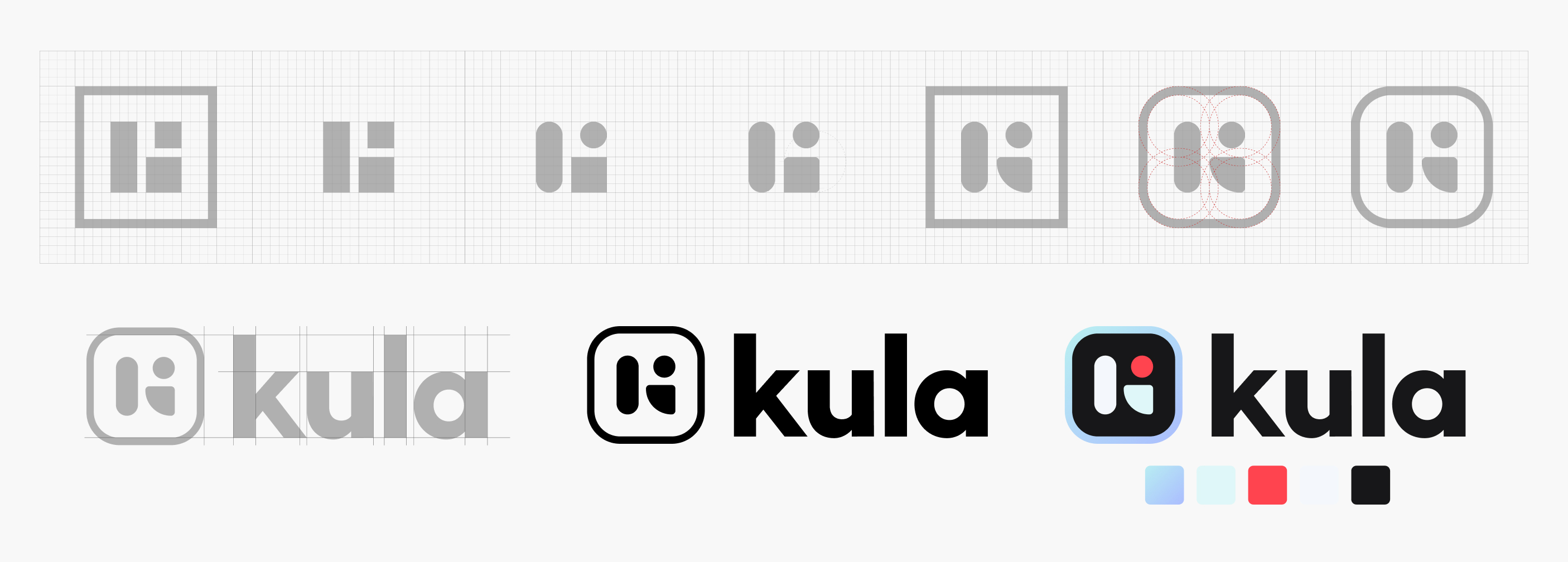
Logo
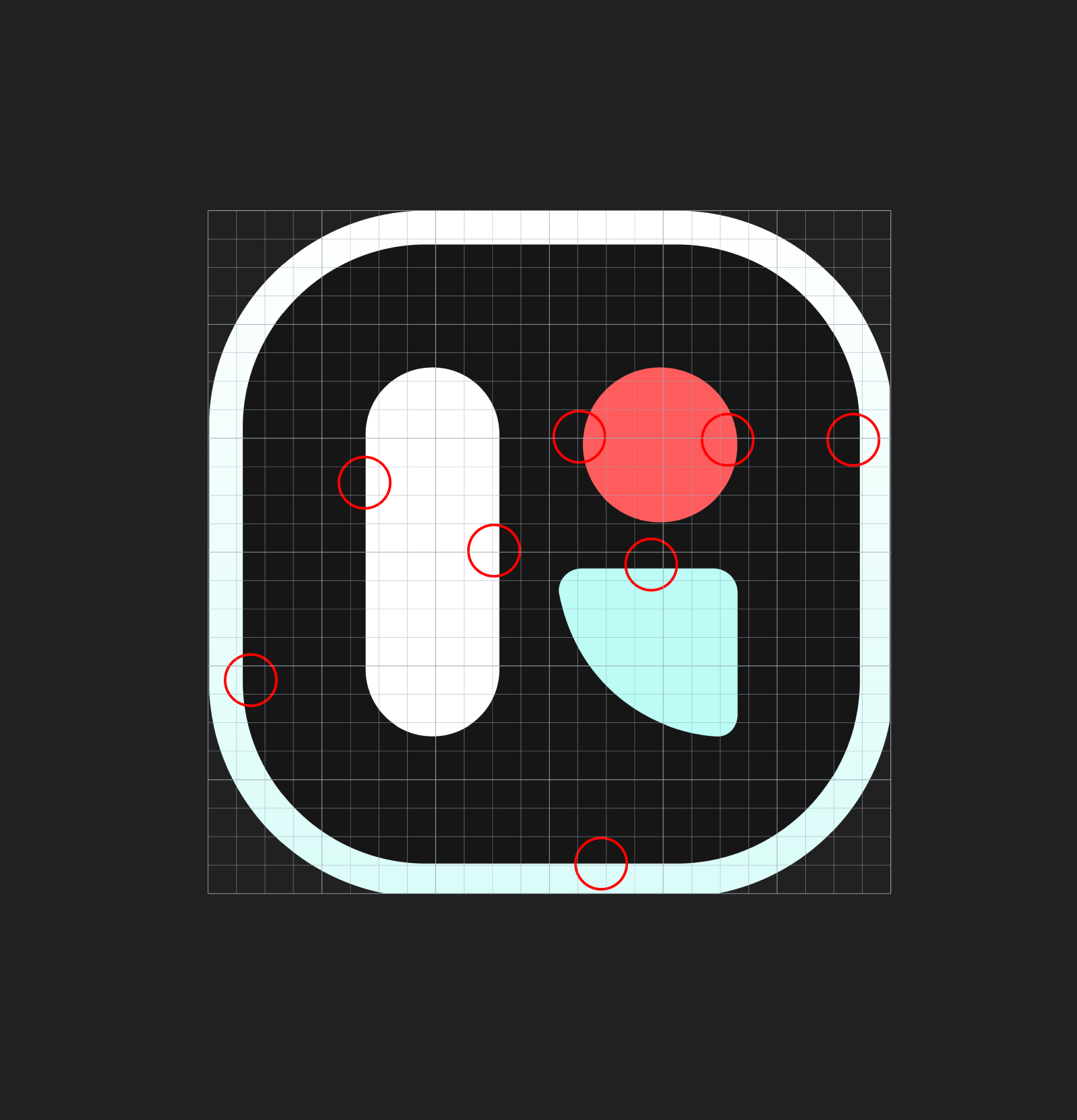
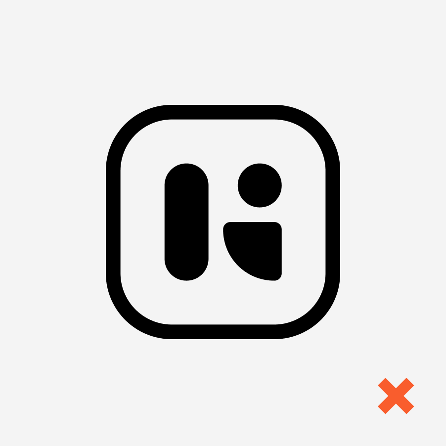
Same Logo, rebuilt
The old logo had alignment issues that broke its balance at small sizes. I rebuilt it from the ground up to fix that, keeping the design itself untouched.
Tones & Styles


The Colour
Primary Color
Portland Orange
#F95D2D
This Color was chosen early on to set the brand apart from competitors and the usual SaaS palette.
Shades
#FB8C6A
#FCB29C
#FED9CD
#FEECE6
#C63306
#631A03
#320D01
#190601
Accent Color
Dark Moon
#171717
We picked a high-contrast dark grey on white instead of pure black. Black gets heavy at larger sizes; dark grey holds the weight without feeling aggressive.
Shades
#90959D
#ABAFB5
#C6C9CD
#E1E3E5
#757B85
#5D626A
#45494F
#2D3034
Secondary Color
Baby Blue Eyes
#97C7FF
The complementary was Wave Blue, but it didn't hold up on contrast. We picked the closest blue that did.
Shades
#ADD3FF
#C2DEFF
#D6E9FF
#EBF4FF
#3391FF
#005ECC
#002F66
#001733
Backgrounds
Floral White
#FEF8F0
Ghost White
#F9F9F9
Extended Colors
#A111A9
#D1214B
#FCB29C
#FAC166
#4B7BF8
#8B89F8
#94DEAE
#FCB29C
Gradients
#ADD3FF
#FED9CD
#5D626A
#094EFF
#FB8C6A
#F95D2D
#2D3034
#03BCFF
Typography
Primary Font
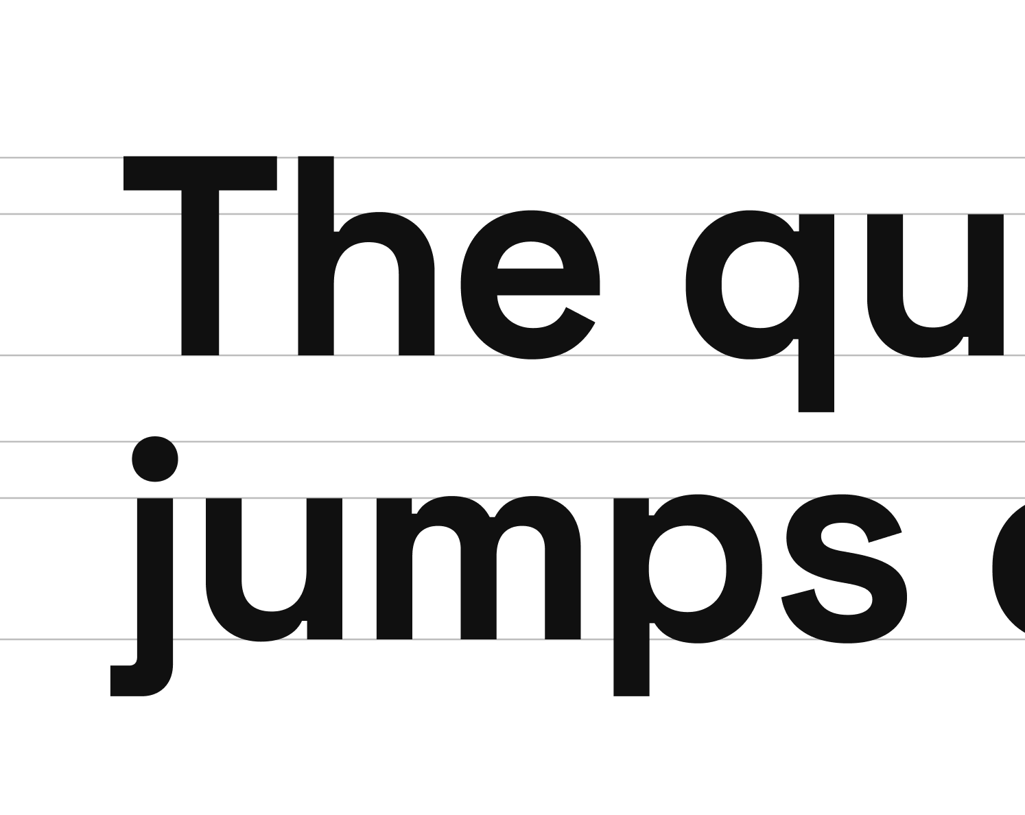
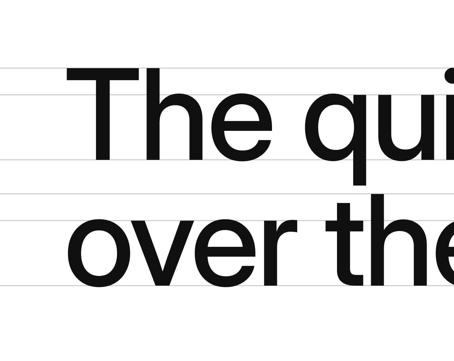
Space Grotesk
For headings, Space Grotesk was the call. Modern, a little distinctive, and it carries the product's tone.
Secondary Font
Inter Display
Wanted the design to carry the same weight as the product, sharp, modern, credible.
Iconography
Clarity Over Cleverness.
Icon set constructed on IBM's traditional grid system to ensure pixel-perfect alignment across sizes.

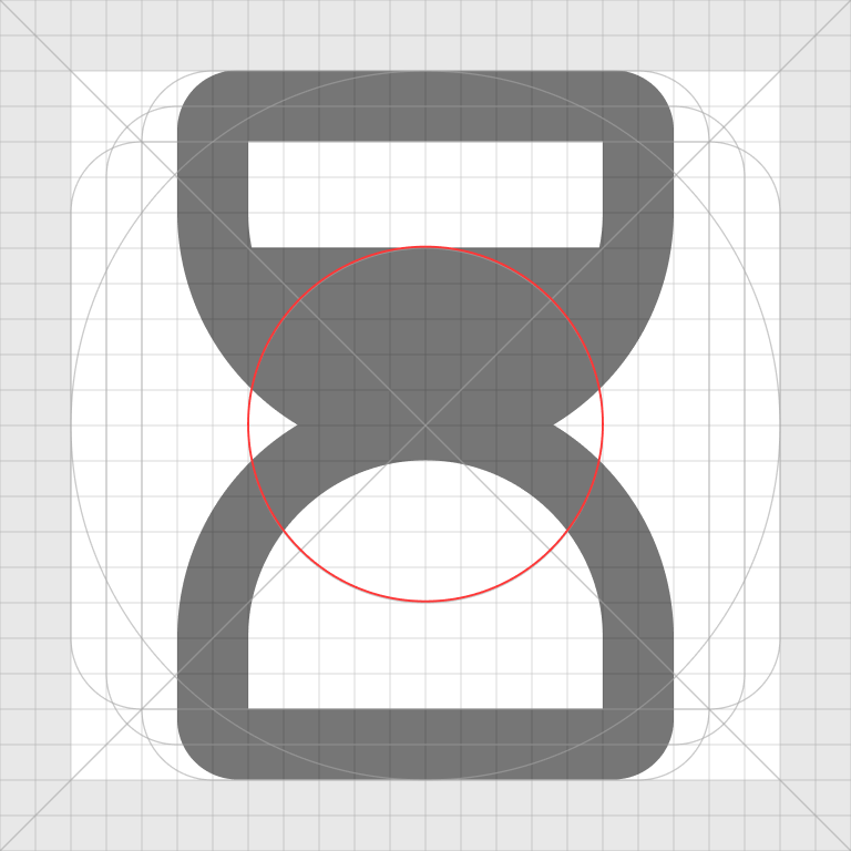

Image Style


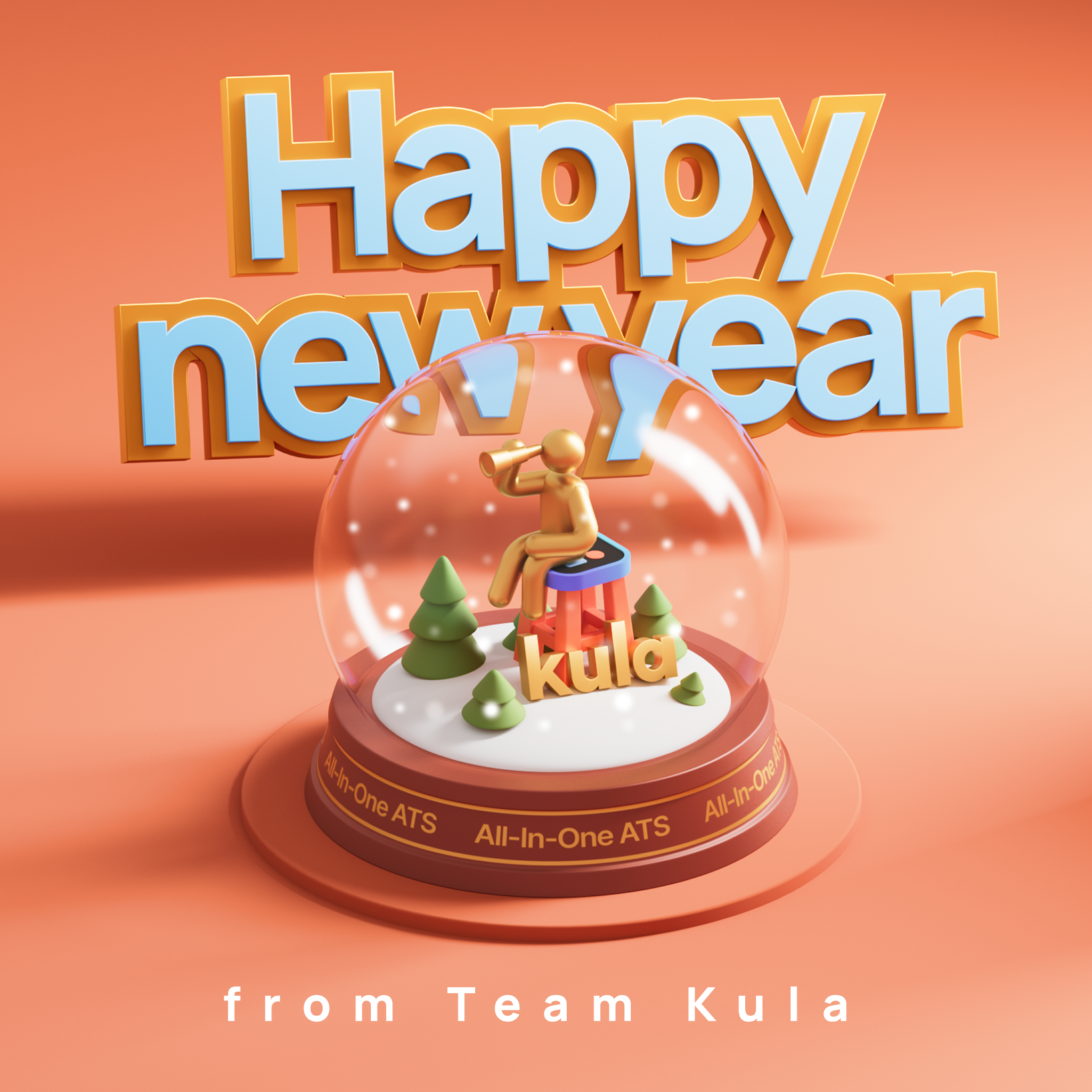
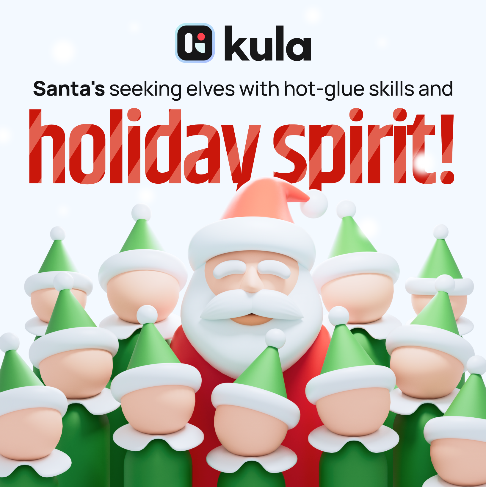
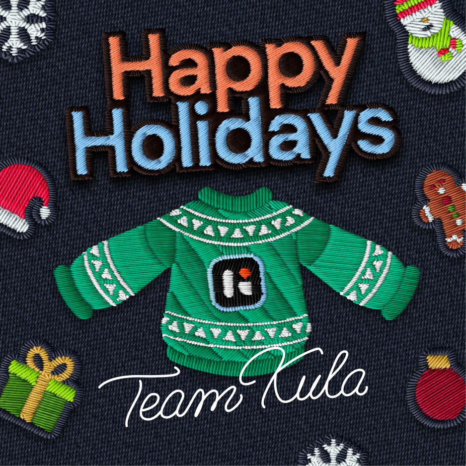
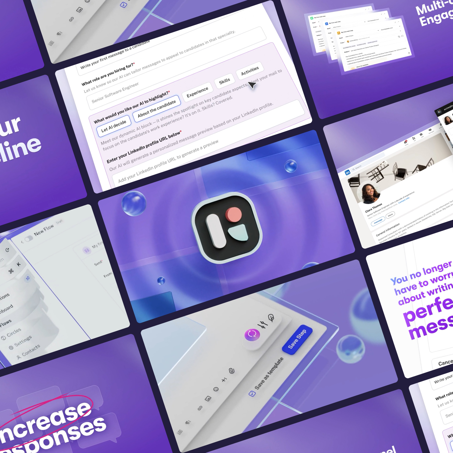
Social media presence and content
Social content built around brand language and 3D-rendered compositions


Webpage
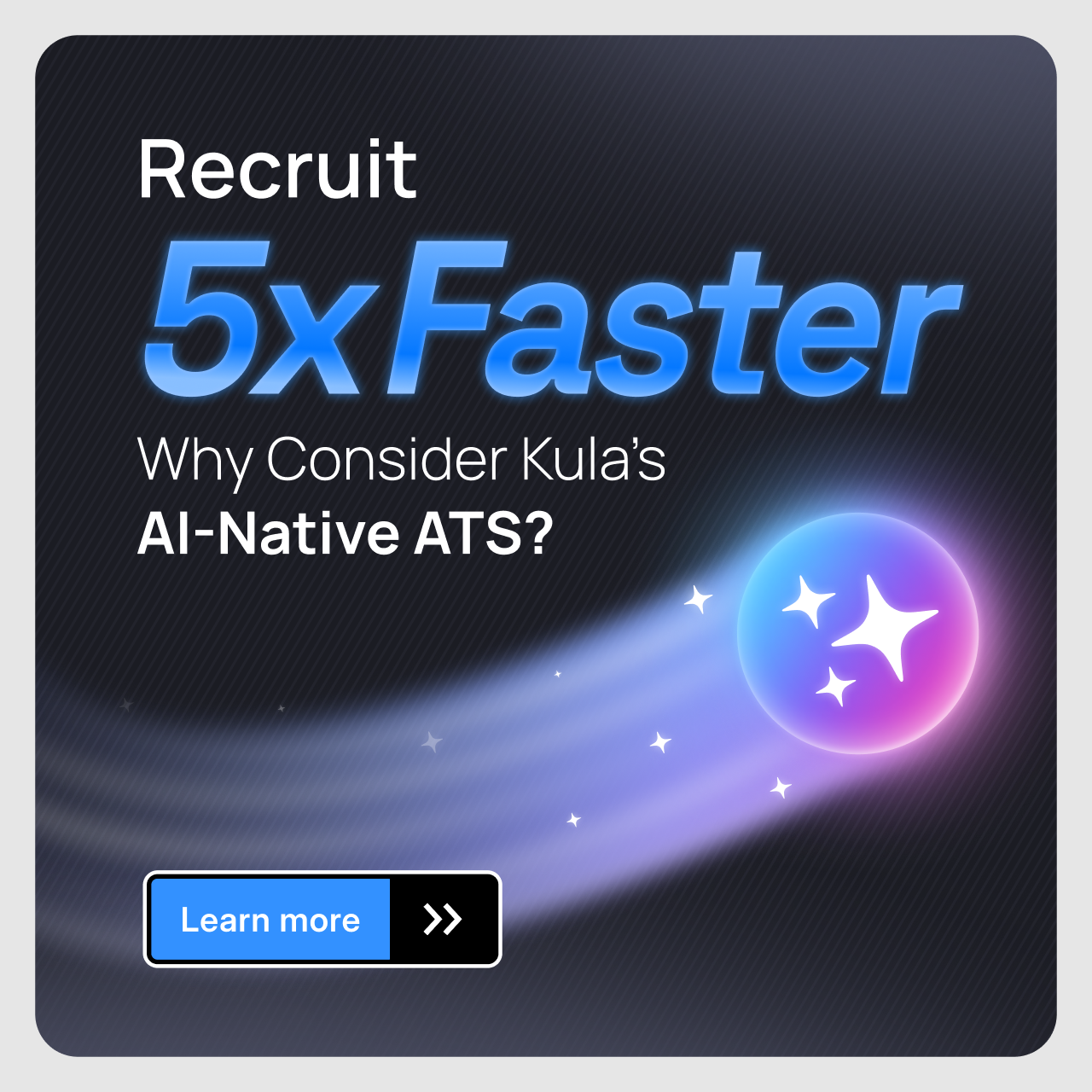
Advertising and campaigns

What I took away
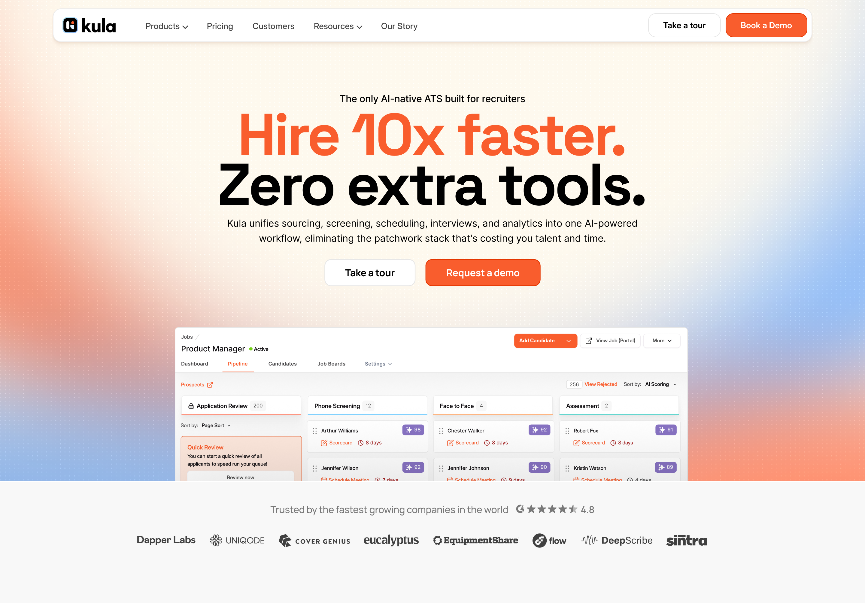
Kula didn't need a new brand. It needed scaffolding around the one it already had.The logo stayed. The orange stayed.
What got built was everything around them, a personality the team could point to, a color hierarchy that actually held up, a type system, and rules the next designer can read instead of guess at.
What got built was everything around them, a personality the team could point to, a color hierarchy that actually held up, a type system, and rules the next designer can read instead of guess at.
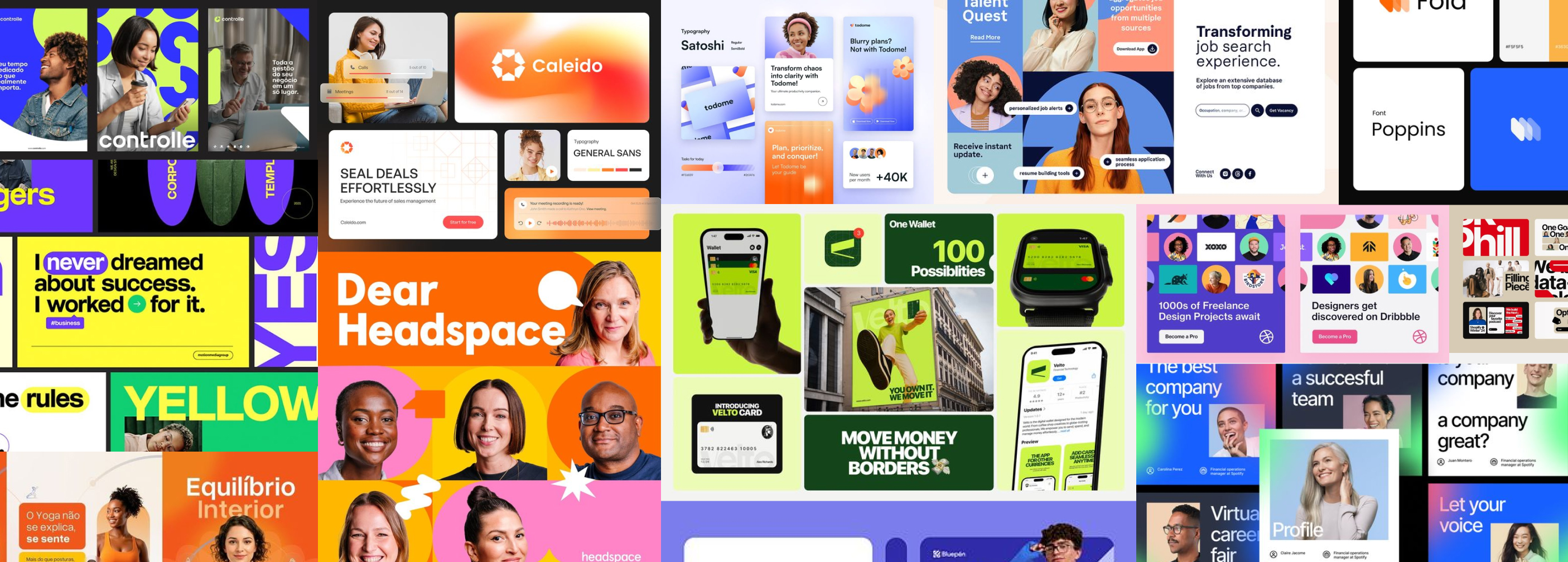
Related work
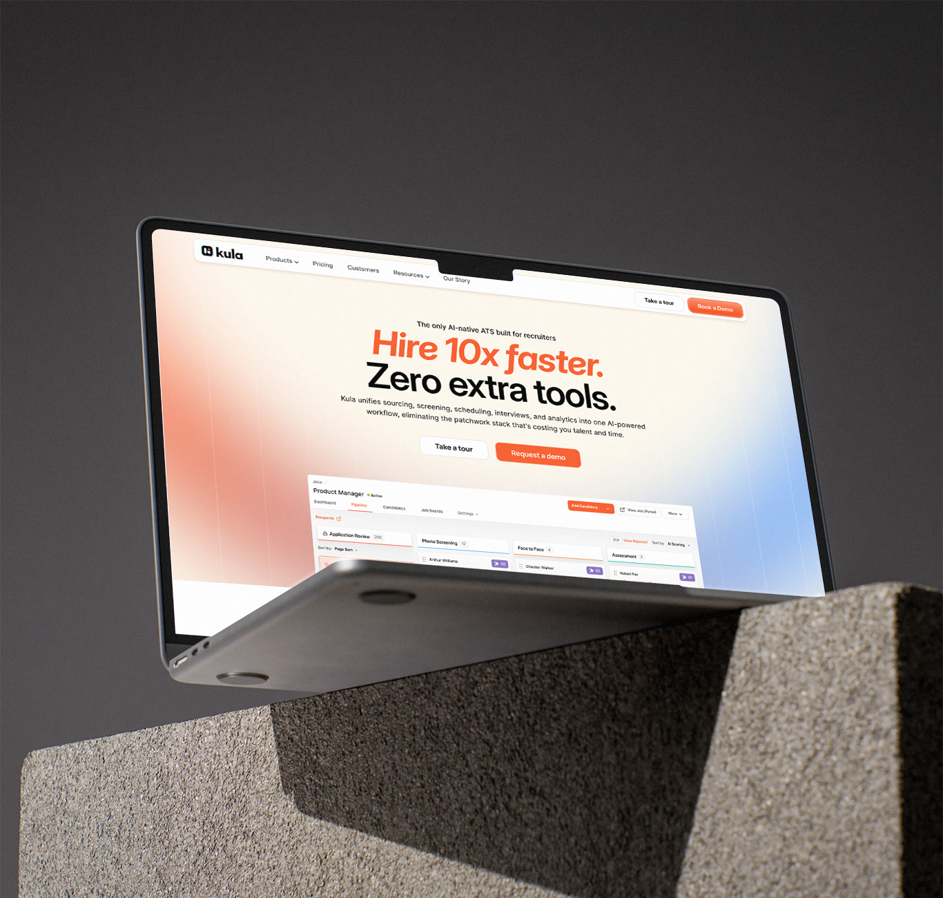
Kula Homepage Revamp
Transforming a complex AI recruiting platform into a clear, premium, story-driven web experienc
Web · Motion · SaaS · Storytelling
Explainer & Promo Videos
Simplifying product features into engaging motion-led narratives for marketing and onboarding
Motion · Product · Marketing